Most hero animations are trying to say, “look how polished this website is.”
That is not a terrible goal. It is just a fairly expensive way to say very little.
When I was rebuilding the first screen for Mosaqo, I had a more practical problem. A new visitor needed to understand why this was not just another page that generates a QR image.
The product difference is simple once someone sees it: you can print a dynamic QR code once, change the destination later, and keep using the same physical card, label, poster, or package.
But “simple once someone sees it” is doing a lot of work in that sentence.
The old hero had decorative QR cards floating around the headline. They looked related to the product. They did not explain the product. A visitor still had to read the copy, understand what a dynamic destination meant, and imagine why it would matter after printing.
So I replaced the decoration with one small story.
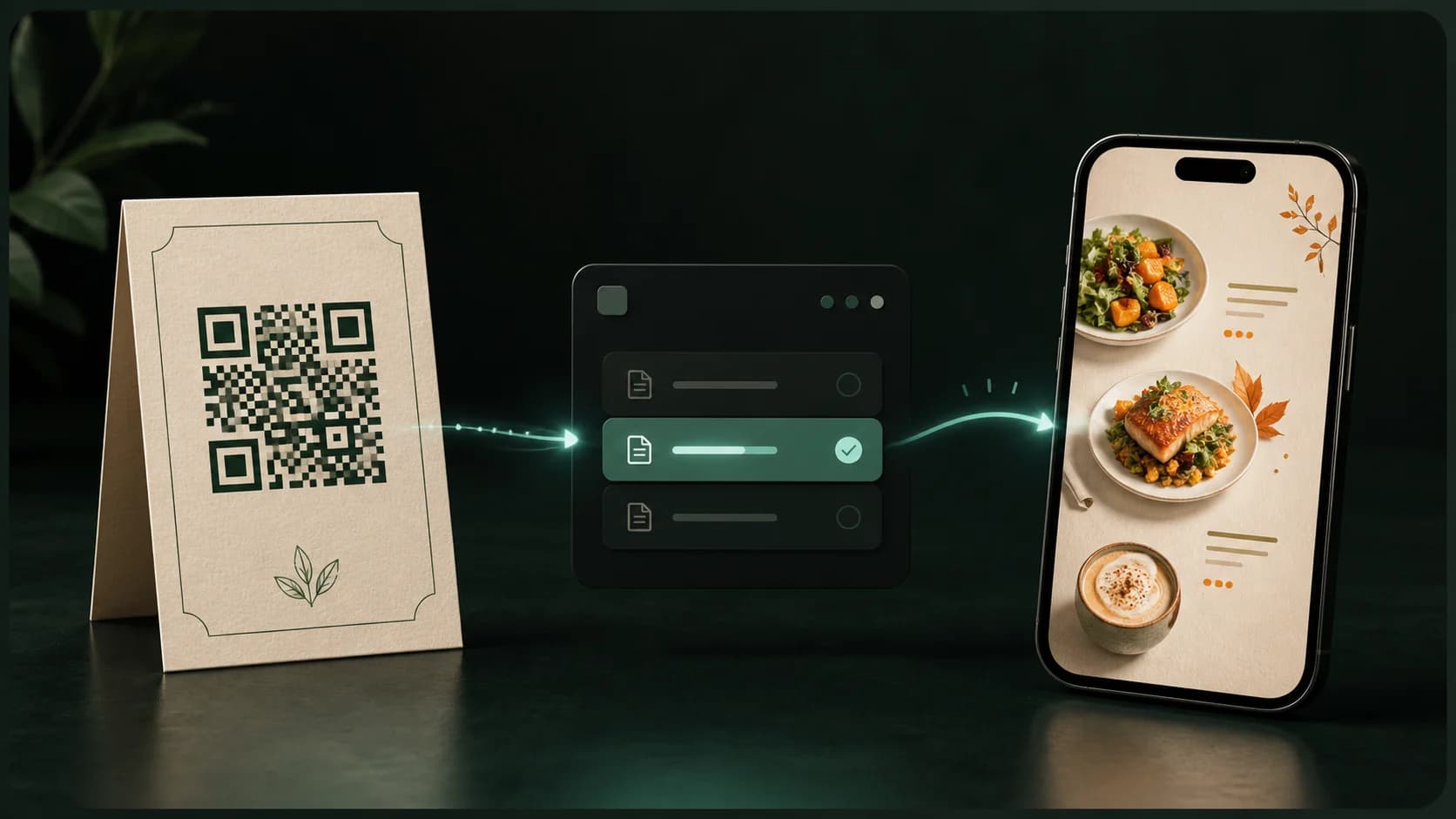
The whole product idea in one café menu
The demo uses a deliberately ordinary scenario:
- a café has a printed QR card on a table
- the owner selects a new menu file in the Mosaqo dashboard
- the change is saved
- someone scans the same printed card
- the new menu opens on their phone
That is it.
No carousel of features. No dashboard flying apart into twelve glass panels. No cursor visiting every corner of the application.
The sequence explains one mechanic that is easy to miss in a feature list:
The printed object stays where it is. The content behind it can keep changing.
For a restaurant that may be a seasonal menu. For another Mosaqo user it may be a product manual, an event schedule, a property listing, a campaign page, or a file that will move long after the packaging has been printed.
The café is only the example. The “same code, new destination” relationship is the product.
That became my first rule for the animation: show the change, not the interface.
Lightweight is a product constraint, not a visual style
Once I knew what the animation had to communicate, the technical direction became much clearer.
I did not want an autoplay video in the most performance-sensitive part of the page. I did not want a Lottie file that looked sharp at one size and awkward at another. I did not need WebGL, a canvas scene, or a physics engine. And I did not want to add a general-purpose animation dependency for a single controlled sequence.
The final demo uses:
- regular HTML elements
- one small inline SVG path for the illustrative QR pattern
- CSS transitions and keyframes
- a React component that only advances the story from one phase to the next
There is no animation library in the Mosaqo web app. The hero also does not need to download a video, poster image, or a set of frame assets before it can explain itself.
That does not mean the demo contains zero JavaScript. “Zero JavaScript” is often treated as the only respectable definition of lightweight, but it is not the useful definition here.
The useful question is: what is JavaScript responsible for?
In this case, JavaScript chooses the current beat. The browser handles the movement between beats.
A timeline made from product states
The animation is easier to reason about because its states use product language instead of visual language.
type Phase =
  | 'rest'
  | 'toField'
  | 'open'
  | 'pick'
  | 'chosen'
  | 'toSave'
  | 'save'
  | 'scan'
  | 'load'
  | 'reveal';

const timeline = [
  { phase: 'toField', hold: 800 },
  { phase: 'open', hold: 650 },
  { phase: 'pick', hold: 1330 },
  { phase: 'chosen', hold: 600 },
  { phase: 'toSave', hold: 750 },
  { phase: 'save', hold: 750 },
  { phase: 'scan', hold: 1650 },
  { phase: 'load', hold: 950 },
  { phase: 'reveal', hold: 3600 },
];
The distinction matters.
If the component had states such as moveLeft, scaleCard, and fadePhone, the
timeline would be coupled to one visual treatment. Using save, scan, and
reveal keeps the code tied to the story. CSS can decide how those moments look.
The component exposes the phase as a data attribute:
<div className="m-demo" role="img" aria-label={t.aria} data-phase={phase}>
  {/* the complete demo scene */}
</div>
Then CSS handles the visual response:
.m-demo__phone {
  transform: rotateY(-13deg) rotateX(4.5deg);
  transition: transform 1.15s cubic-bezier(0.25, 0.8, 0.3, 1);
}

.m-demo[data-phase='load'] .m-demo__phone,
.m-demo[data-phase='reveal'] .m-demo__phone {
  transform: rotateY(-3deg) rotateX(1.5deg) scale(1.04);
}
React does not calculate a position on every frame. It does not continuously write transforms while the phone turns. It changes one attribute and gets out of the way. The browser interpolates the rest.
This split is less clever than a full animation abstraction. That is exactly why I like it.
The complete component has four responsibilities
The snippets above show the interesting transitions, but the component itself is easier to understand as one small system:
- Deterministic data: three menu filenames, three menu covers, and one module-scoped QR path.
- Narrative state: the current phase, the selected dashboard file, the file currently shown on the phone, and a click tick.
- Scheduler: one timeout chain with one cleanup path.
- Rendered scene: the short explanation, printed café card, same-code connection, phone, menu, dashboard field, save state, and cursor.
The separate dashboard and phone indexes are important. The file field changes as soon as the owner picks a menu, but the phone keeps showing the previous one until the code is scanned again. If both surfaces read from one index, the demo would update the customer's phone too early and accidentally explain the product wrong.
The tick has a much smaller job. It changes the React key on a click ripple so
the same CSS animation can restart. Everything else is derived from phase.
There is no second hidden state machine inside the markup.
One timer is enough
The entire sequence advances through one timeout chain inside one effect.
useEffect(() => {
  if (window.matchMedia('(prefers-reduced-motion: reduce)').matches) return;

  let step = -1;
  let timer = 0;

  const advance = () => {
    step = (step + 1) % timeline.length;
    const { phase, hold } = timeline[step];

    setState(previous => ({
      phase,
      fieldIdx:
        phase === 'chosen'
          ? (previous.fieldIdx + 1) % demoFiles.length
          : previous.fieldIdx,
      phoneIdx: phase === 'reveal' ? previous.fieldIdx : previous.phoneIdx,
      tick: previous.tick + 1,
    }));

    timer = window.setTimeout(advance, hold);
  };

  timer = window.setTimeout(advance, 1600);
  return () => window.clearTimeout(timer);
}, []);
There are no parallel intervals trying to stay synchronized. The file picker, printed card, scanner line, phone, and status label all read from the same phase. If I change the pacing later, I can still see the whole narrative in one short array.
The opening pause is intentional. The page gets a moment to settle before the
cursor starts moving. The final reveal holds much longer than the clicks in the
middle because that is the result the visitor needs time to understand.
Fast animation does not make a page feel fast when the viewer has to wait for the loop to come around again to understand what happened.
What did “lightweight” actually save?
“Lightweight” is too convenient a word unless there are numbers beside it. I measured the implementation as it exists in the Mosaqo repository, using gzip level 9 for the source comparisons.
| Measured part | Result | What it means |
|---|---|---|
HeroDemo component source | 11.6 KB raw / 4.1 KB gzip | React state, SVG QR path, and the complete scene |
Core .m-demo CSS block | 18.5 KB raw / 4.3 KB gzip | Layout, transitions, and keyframes before shared responsive rules |
| Animation runtime dependencies | 0 | No Framer Motion, GSAP, Lottie, or player runtime |
| Animation-specific media requests | 0 | No video, poster, image sequence, or downloaded QR asset |
| React updates in one loop | 9 over 11.08 seconds | About 0.81 state updates per second, driven by one active timeout |
These are source-level measurements, not a claim that the browser downloads exactly 8.4 KB. Next.js minifies, bundles, and compresses the component together with route code, so presenting the source gzip sum as a production chunk would be false precision.
There is, however, one useful historical comparison. The previous decorative
hero shared a continuous requestAnimationFrame loop with the product showcase.
While the page was visible, that scheduler asked for a JavaScript callback on
every display frame and wrote several CSS variables even when the pointer was
still. The new hero does not run JavaScript per animation frame. At 60 Hz, the
old loop could request up to 60 callbacks per second; the narrative timeline
averages 0.81 React updates per second. CSS still paints and composites the
motion, of course, but React is not steering every frame.
I am deliberately not publishing an LCP: X → Y claim. I never shipped a video
or animation-library version of this exact hero, so there is no controlled
before-and-after build to compare. The honest evidence is narrower: the current
demo adds no animation dependency, makes no media request, reserves its layout
on the server, and removes the old continuous JavaScript animation loop.
What happens when nobody is watching?
Production animation has a few less glamorous states: the user changes tabs, scrolls past the hero, enables reduced motion, or leaves the route altogether.
The current behavior is intentionally simple:
- Unmounting is clean. The effect clears its one active timeout, so a route change cannot leave the sequence updating a dead component.
- A background tab does not build a queue. Browsers throttle timers in hidden tabs. Because the next timeout is scheduled only after the current callback runs, there is never more than one pending timeline callback. The browser may advance the story slowly while hidden, but returning to Mosaqo does not replay a burst of accumulated interval ticks.
- Scrolling past the hero does not currently pause it. The timeline keeps one
low-frequency timeout alive, and the CSS motion continues. With 0.81 React
updates per second, an
IntersectionObserverwould add more lifecycle logic than it saves today. - Reduced motion stops the story before it starts. No timeout is scheduled, and the matching media query collapses CSS animation and transition durations.
If the homepage gained several animated demos, heavier canvas work, or analytics
showed meaningful offscreen main-thread cost, I would add an
IntersectionObserver and explicit visibilitychange handling. I would also
decide whether resuming should continue the current phase or restart at rest.
That is a product decision: a user returning to the hero should see a coherent
story, not merely whatever timestamp the browser thinks comes next.
The browser receives a useful first frame
Before hydration, the server renders the complete scene in its rest state.
The printed card, phone, and dashboard strip already have their space. There is
no blank rectangle waiting for a client-only animation player to mount, and no
late media dimensions pushing the hero around.
The decorative QR pattern is also deterministic. It is generated once at module scope from a fixed seed and rendered as one SVG path. The server and browser get the same matrix, so hydration stays quiet. It is intentionally illustrative, not a real scannable code.
That decision is small, but it captures the kind of detail I care about in a hero: the visual can feel alive without making the first render fragile.
Movement has to follow attention
The demo contains several objects, but they are not all allowed to ask for attention at once.
The cursor moves to the field. The dropdown opens. One file is selected. The save button confirms the change. Only then does the light move toward the physical card. The scan happens. The phone turns toward the viewer. The new menu appears.
A soft spotlight follows that path from dashboard to card to phone. It is a visual guide, not another storyline. The floating motion is intentionally slow, and the meaningful actions use clearer, shorter transitions.
This is where many hero animations become heavy even before we talk about kilobytes. They are cognitively heavy. Three cards bob, a graph counts up, a cursor clicks, a gradient rotates, and the headline animates word by word. The browser may render it at 60 frames per second, but the person still has no idea where to look.
Lightweight should describe the amount of attention an animation consumes too.
The still version must still make sense
Someone who prefers reduced motion does not get a broken or half-finished hero.
The effect checks prefers-reduced-motion before starting the timeline, so the
demo remains a stable diagram. A matching media query removes the remaining CSS
animation and transition duration across the marketing page.
The complete composition is exposed to assistive technology as one labelled image. Its many tiny visual fragments are hidden because reading out every button, filename, menu item, and decorative mark would describe the DOM, not the idea. The accessible label describes the outcome in one sentence: a new file is saved, and the same printed café card opens it.
This is another useful test for product animation:
If you cannot explain its meaning in one sentence, the animation may be trying to do too many jobs.
Twenty-five languages changed the implementation
Mosaqo ships its marketing surface in 25 locales, including right-to-left languages. That makes “just animate this label over here” a less innocent request.
The lead sentence uses placeholders for the two emphasized phrases instead of being assembled from English fragments. A translator can move “dashboard” and “printed code” wherever the language needs them.
Labels have width limits and can wrap. Cursor positions use logical CSS
properties such as inset-inline-end, so the sequence mirrors instead of
hard-coding a second set of coordinates for RTL. On small screens, the physical
card–arrow–phone scene scales as one composition, while the dashboard strip
wraps so the changing filename stays readable.
These details do not make the animation more impressive in a screen recording. They make it survive contact with the actual product.
Why I did not reuse a bigger animation system
I have used Framer Motion before, and I still think it is a good tool when a product needs shared layout transitions, gestures, springs, or many coordinated interactive surfaces. I wrote more about that trade-off in CSS animations without Framer Motion.
Mosaqo's hero did not need those capabilities.
Adding a library would have made some lines shorter, but line count was not the constraint. The constraint was keeping the first screen direct, resilient, and cheap to understand.
Native CSS was enough for interpolation. React was enough for the narrative state. SVG was enough for the QR illustration. The best technical stack for this block turned out to be the stack the page already had.
What the animation is really selling
The hero is not trying to sell animation. It is not even trying to sell QR code design.
It is selling relief from a very physical problem: printed things outlive the URLs, files, offers, menus, and campaigns behind them.
That is why the printed café card stays visually present through the whole sequence. The dashboard changes. The phone changes. The physical object does not.
That relationship leads naturally into the rest of Mosaqo: branded QR codes, editable destinations, scan analytics, print-ready exports, reusable workspaces, and web and mobile tools for managing the campaign after launch. The hero only demonstrates the first promise. The product carries it forward.
The rule I am keeping
I now think a good hero animation should pass three tests:
- it explains something the headline cannot show on its own
- it has a useful first frame and a useful reduced-motion state
- it costs less attention and less runtime than the idea is worth
If it fails the first test, it is decoration. If it fails the second, it is a video player pretending to be interface. If it fails the third, the homepage is making the visitor pay for the team's excitement.
The Mosaqo demo is not lightweight because nothing moves.
It is lightweight because every moving part has one job: show that the content can change while the printed QR code stays the same.
Discussion
Responses
No approved responses yet.